The Outpost
COLLABORTATION
Designed for The Outpost and The Compound, Amsterdam, The Netherlands.
Two video production studios. One focuses on 3D animations and visual effects (The Outpost), the other one focuses on post production (The Compound). There is no project that they can't handle together and they certainly like a challenge. Both studios are not that big, but are great at what they do. It just happens to be that the two studios work together very often. They asked me to design a new brand for them. An identity they could use to brand the projects they work on together. A brand that could represent both of the studios.

THE PROCESS
X Marks the Spot
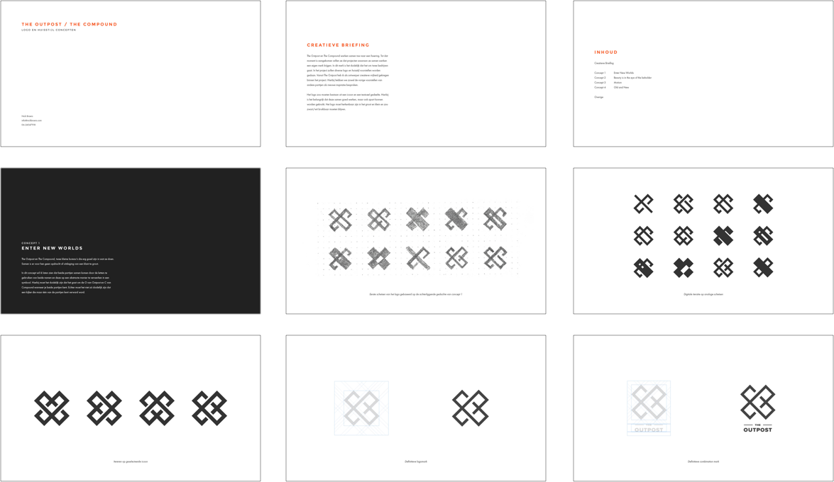
The Outpost and The Compound work together frequently. The two companies are stronger as one and will accept any challenge. In this concept I wanted to create a symbol out of the initials from both companies, the "O" and the "C". I really liked the concept of a cross. X marks the spot, the sweet spot for any video project.
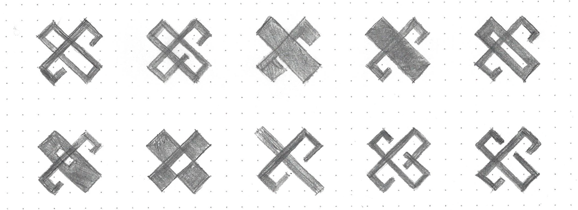

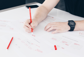
Initial pencil sketches for a logo based on the concept.
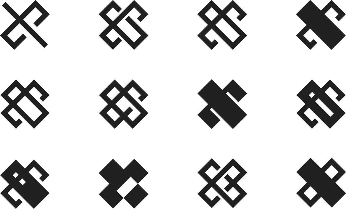

Digital iteration on analog sketches.
X MARKS THE SPOT
Style and Branding
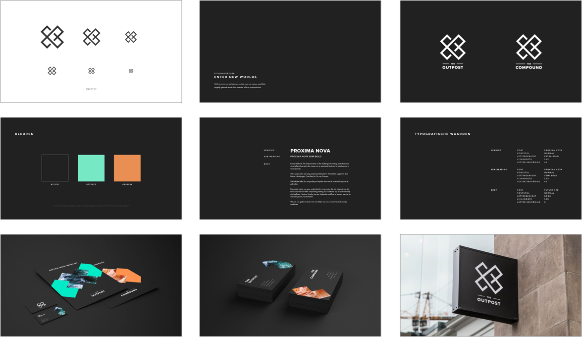
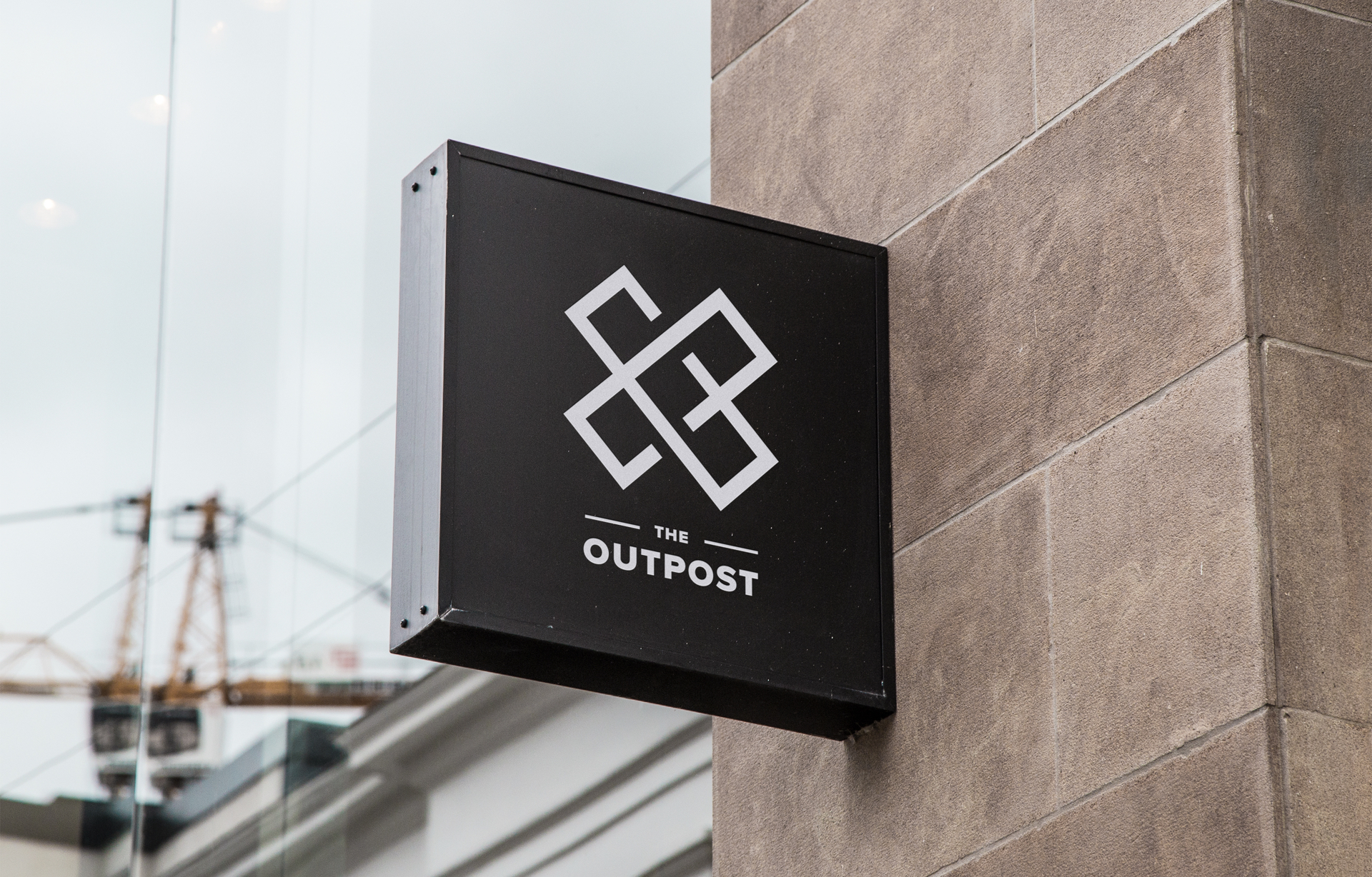
The final shape of the logo is really clean, with straight edges and lines. The composition of the logo and the word mark can make it seem like a badge. My vision for the style and branding is to compliment that badge with a very classy look. The style could be very simple and elegant, but not too simple (in a shy or quiet way). Style and elegance should be combined with daring and bold features in this project.


Final logo marks for both companies.

COLOR CHOICES
The colors of the brand are one of the things where the bold and risky features could shine through. In the end the two companies like to work together because they can support each other in different ways. That is why I decided to choose two very contrastic colors, one for each company. I choose to use slightly less vibrant colors because of the high contrast.


TYPOGRAPHY
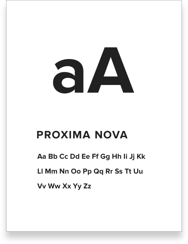
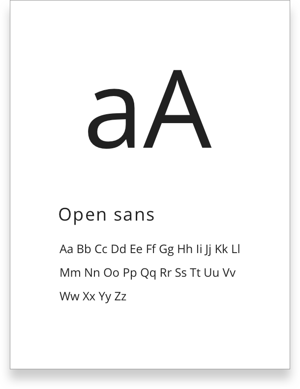
Because of the extremely contrasting colors I decided to use a little more simple typography. While the heading text is still very bold (Proxima Nova) it suits the logo mark very well. We choose to use Open Sans as the body text because of its simplicity and readability.


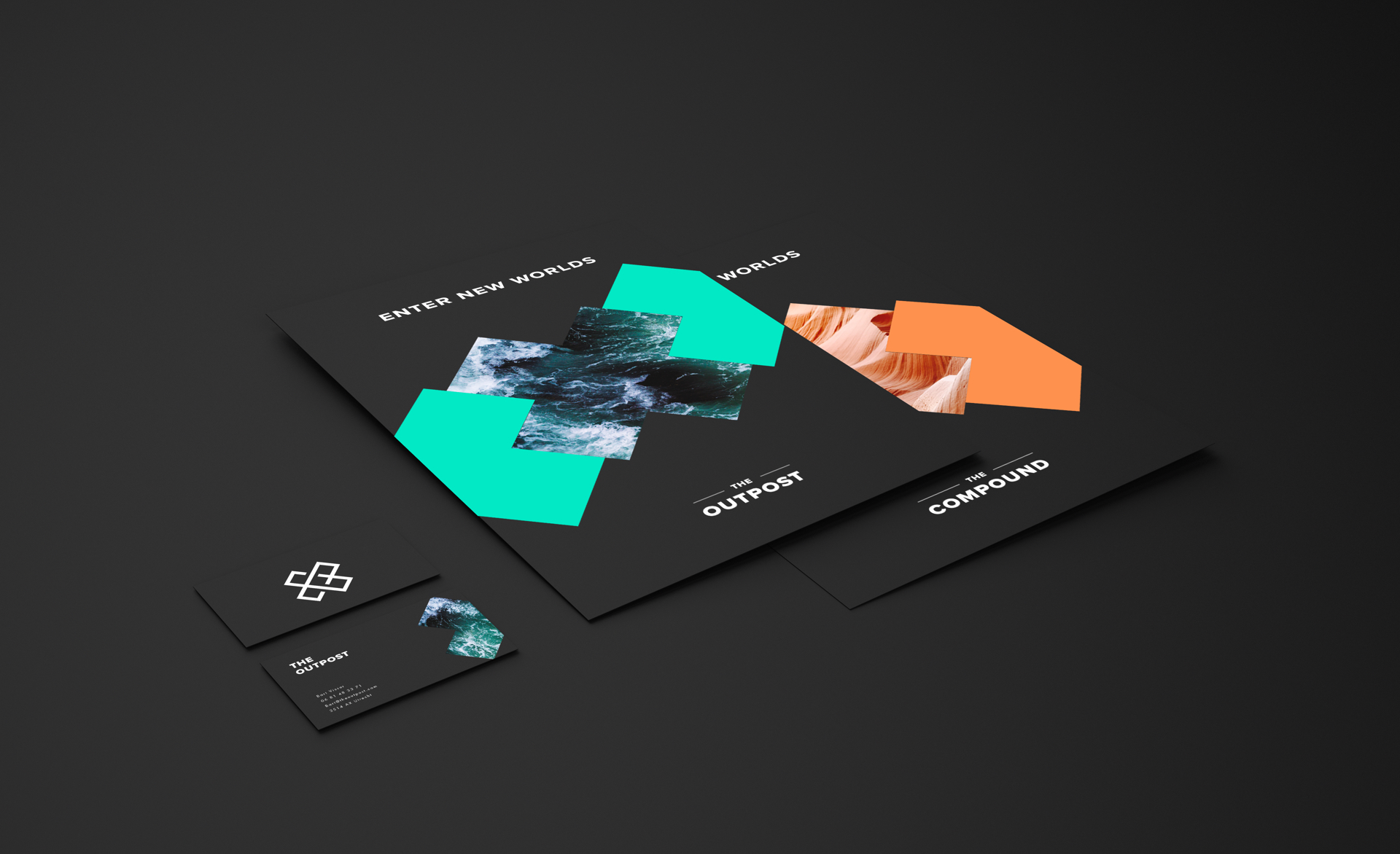
ENTER NEW WORLDS
The possibilities of post production and visual effects are endless. They can turn any boring scene into a full action movie. Post production and visual effects allow the viewer to enter new worlds. In the branding concept I decided to use the X from the logo as a portal to new worlds. The Oupost gets the vibrant cyan-like color with an image of water with a very strong current. With their visual effects they can change any scene. Just like water, they are adaptable. The Compound gets the sandy orange color with an image of the desert. Post production is a solid foundation and backbone of any video production, just like sand or stone.

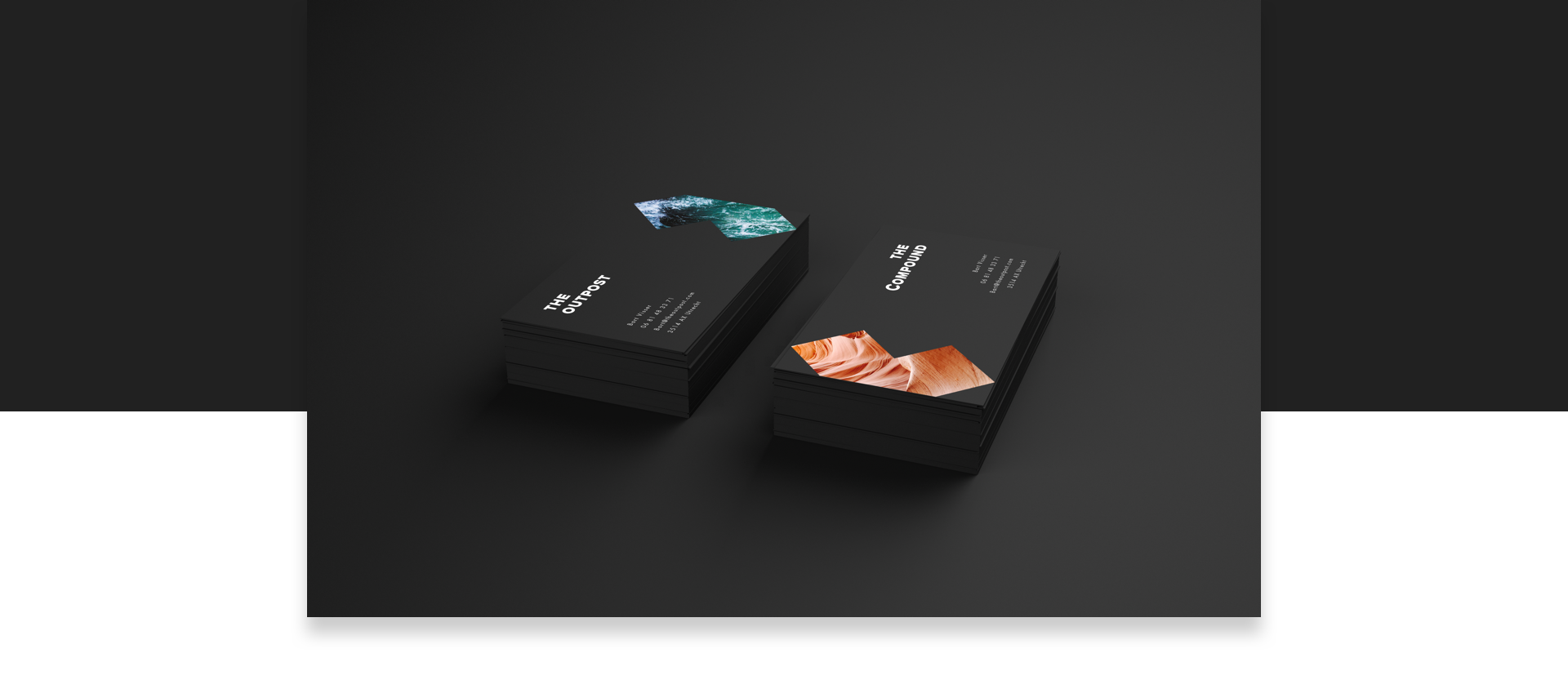
FIFTY / FIFTY
While both companies create amazing things, together they feel like they can accomplish anything. This also shows through their business cards. A card of one company is just one half of the entiry logo. To complete the visual you need both companies.

THE PROCESS
Behind the scenes
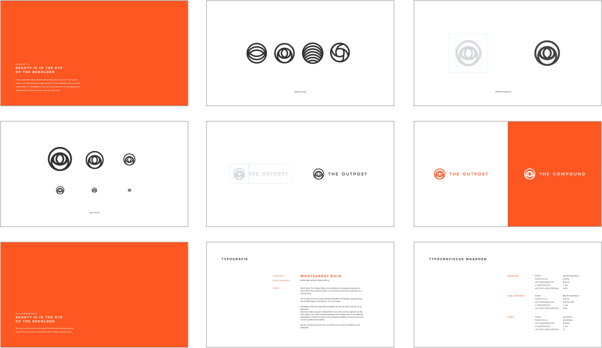
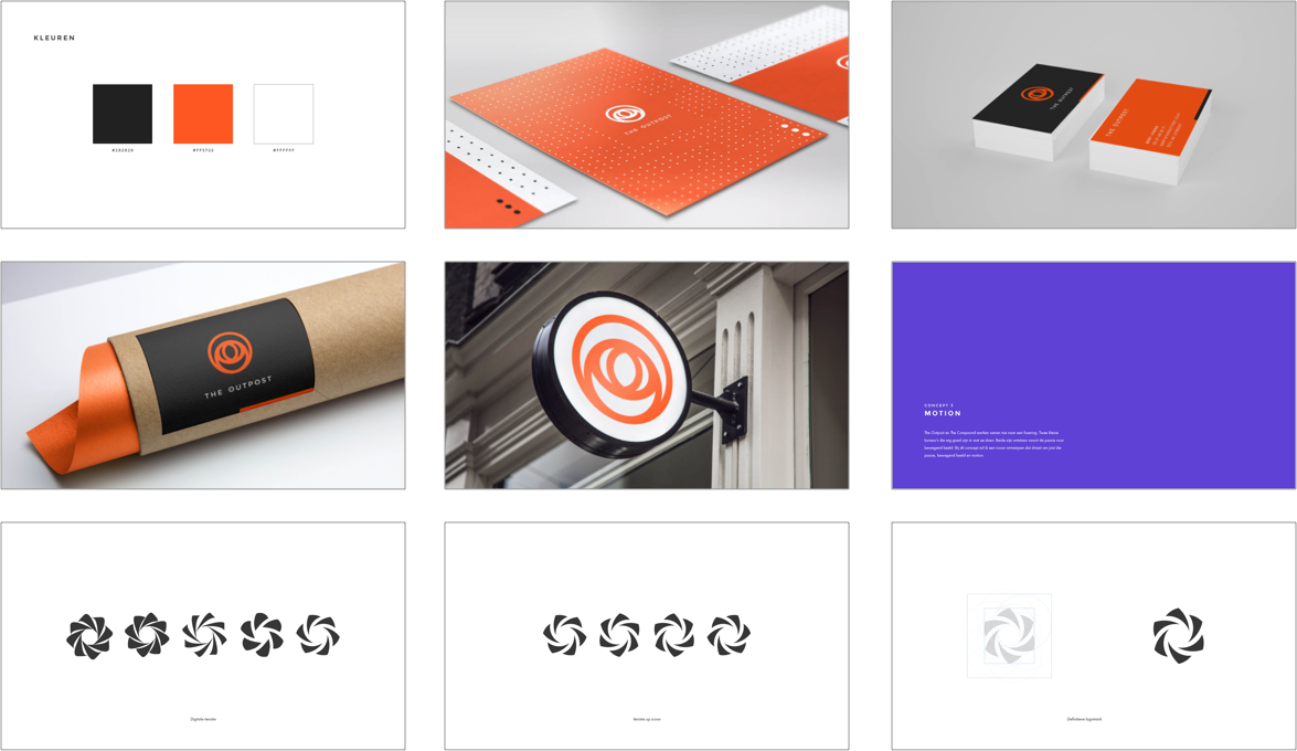
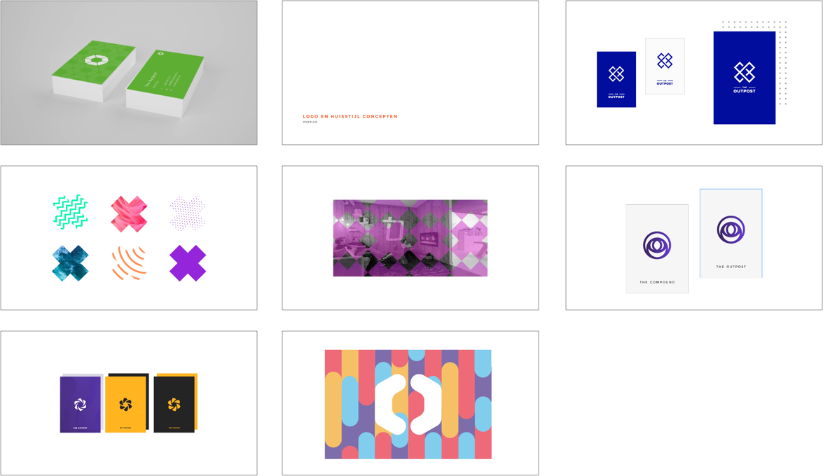
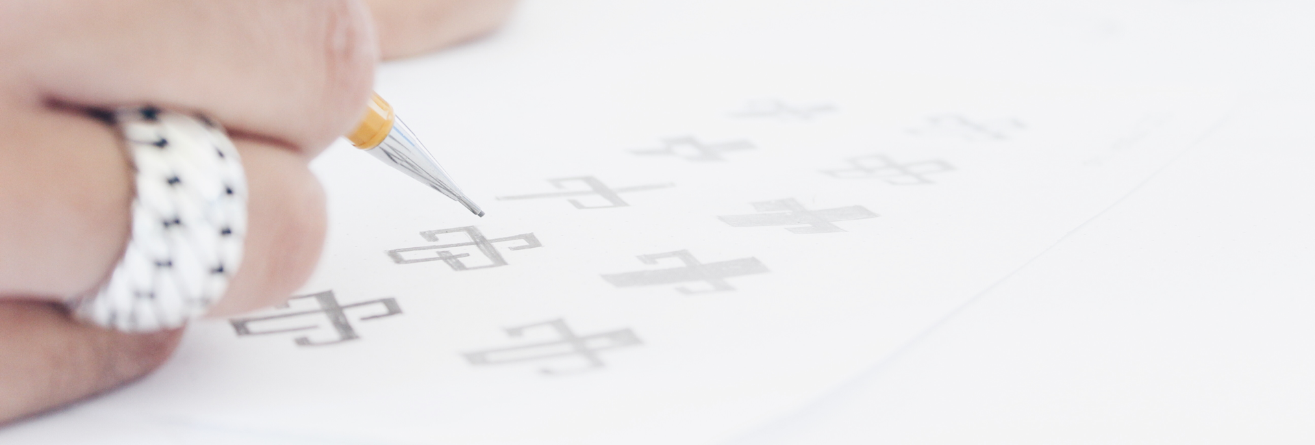
Every concept started with me sketching my ideas on paper. Selected ideas then got translated to my Adobe Illustrator artboard in which I could define my ideas even further. After that, every concept/idea got a new art board in which I could experiment. After a few selection and iteration rounds I finished with four concepts, of which I liked two very much. Since the client has a creative background I decided to share my whole process and thinking in a 63 page document. The brand is currently still in development and I will update this project once it's finished.
